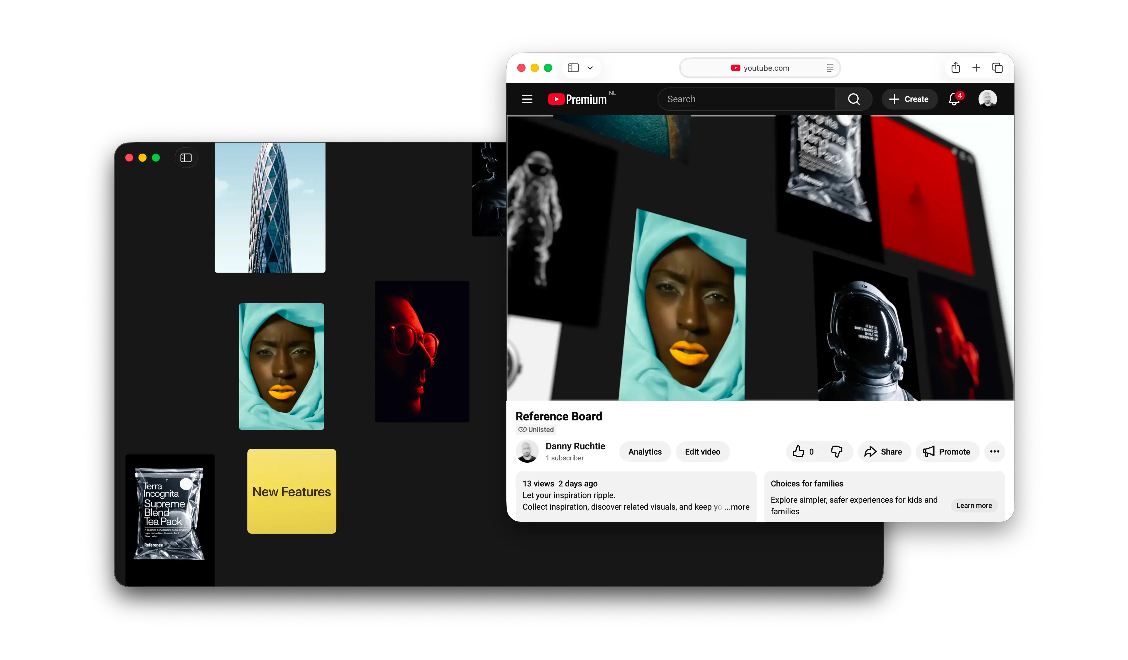
MCP gives Reference a new interface
Reference Board 1.3.7 introduces MCP support on Mac, giving approved AI tools such as Codex and Claude a new way to find, understand, and work with your boards without taking control away from you.

Apps are gaining another way in
Apps have always been controlled through interfaces made for people: windows, buttons, menus, gestures, and keyboard shortcuts. Those interfaces are still the heart of a good app. A visual tool like Reference should remain visual.
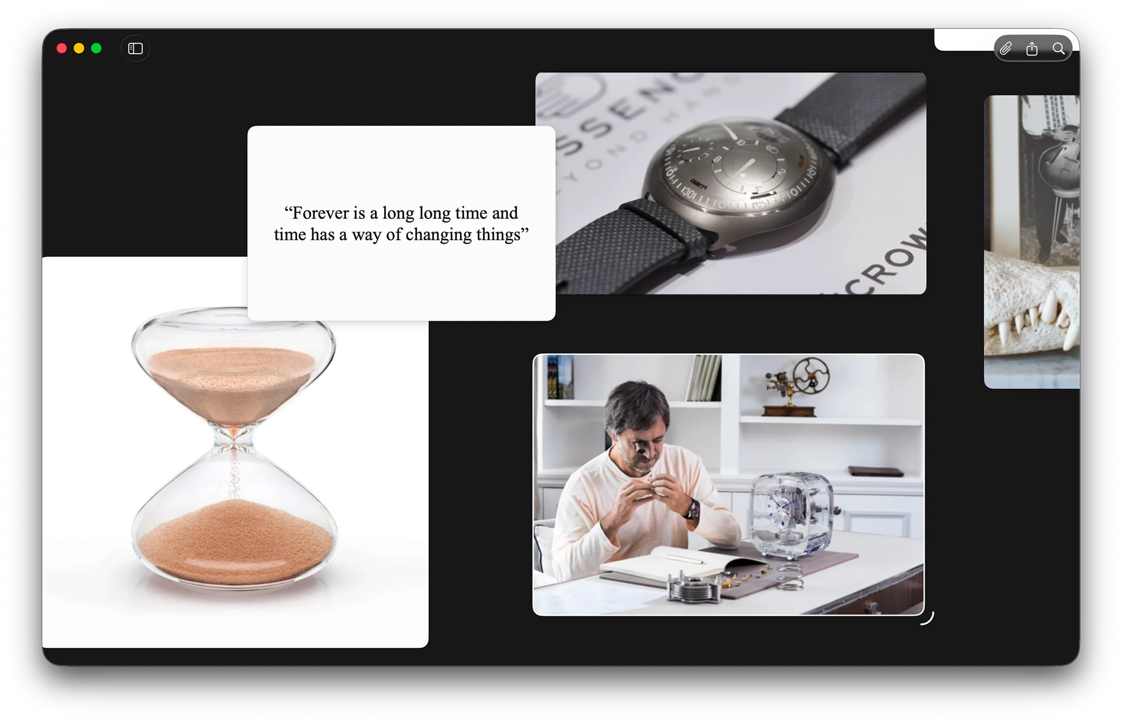
But AI introduces another way to work. Instead of learning where every command lives, you can describe an outcome: find the references that use warm materials, collect them into a region, prepare the board for review, and export it as a PDF.
The Model Context Protocol, or MCP, gives an AI tool a shared way to understand what an app can do and use those capabilities safely. Reference can support compatible tools without building a separate integration for every model or assistant.
We think of it as a new surface for the app: not another screen, but an interface made for tools that can reason.
From commands to outcomes
A traditional interface asks you to perform each step. With MCP, you can start with the goal. An AI tool can find the right Reference actions, propose a plan, and carry out the parts you approve.
The canvas is still the best place to see, judge, and adjust visual work. MCP becomes useful when a task spans several actions or needs context from other tools. That is what makes it feel less like a feature and more like an interface.
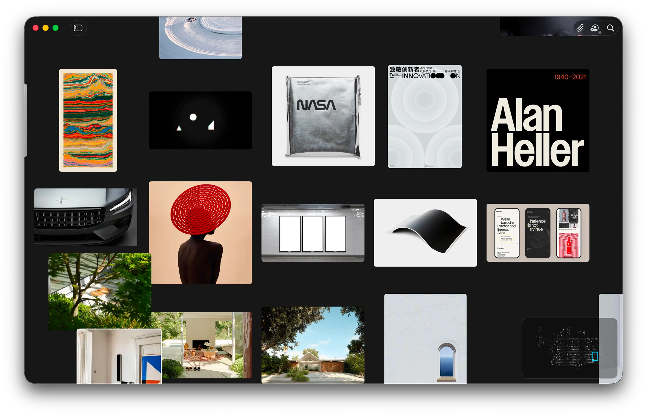
A board becomes something an AI tool can understand
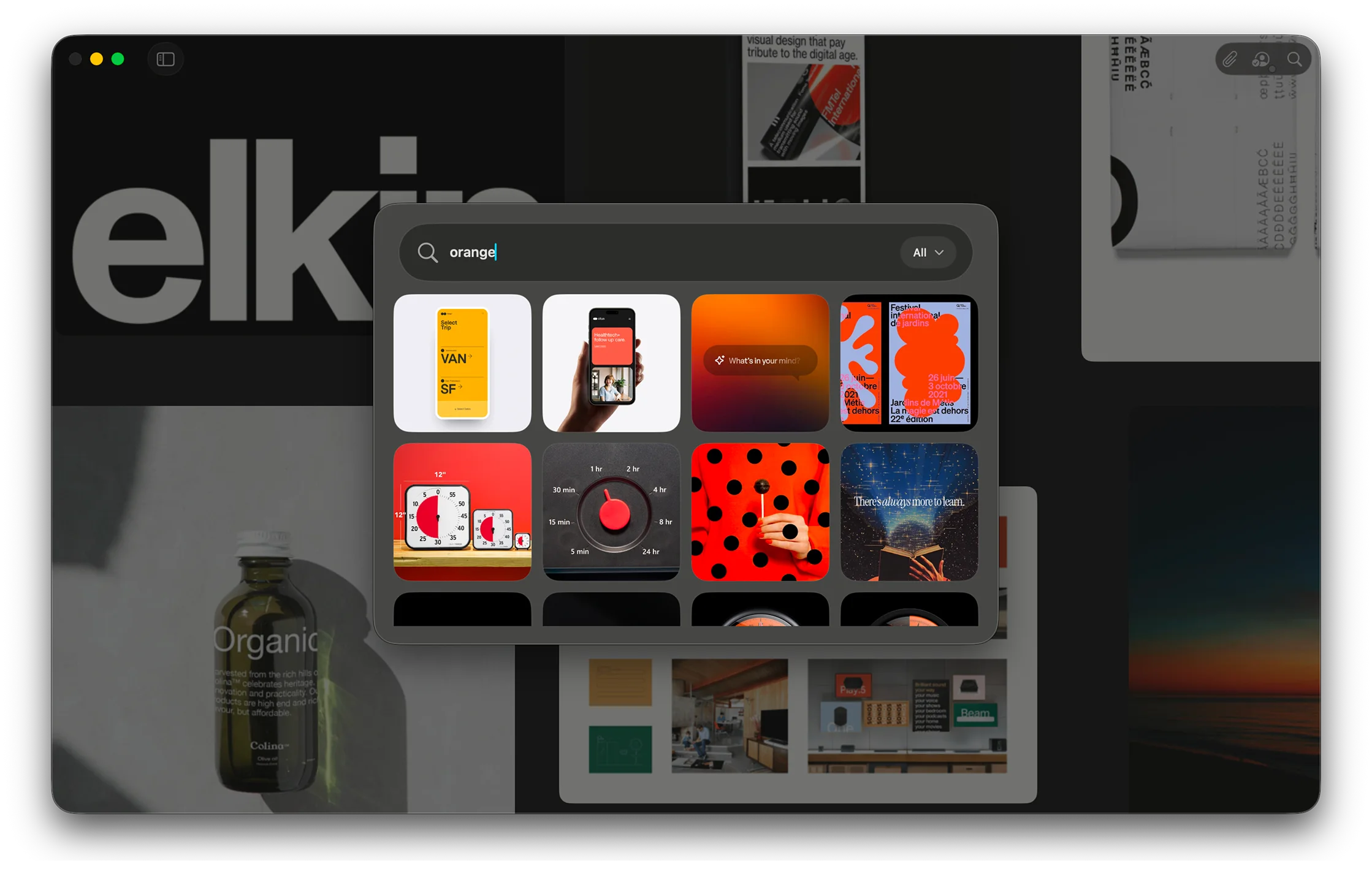
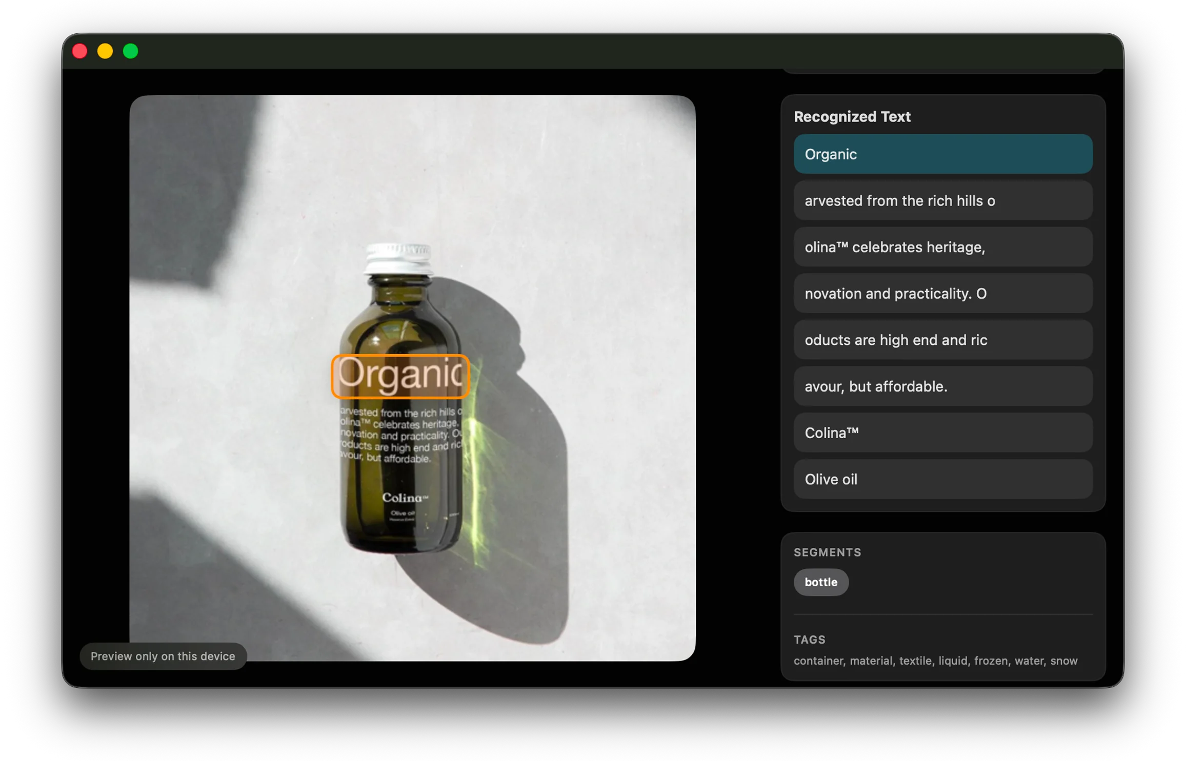
Reference Board 1.3.7 introduces a local connection on Mac for Codex, Claude, and other compatible AI tools. Once you enable it in Settings, an approved tool can search your boards, understand image previews, and work with items and regions.
That can turn a request into a useful sequence. Find the strongest references for a direction. Explain the visual language of a board. Propose a cleaner arrangement. Add or move content after you approve the plan. Prepare the result for review and export it as a PNG or PDF.
The important part is that the tool understands Reference through boards, items, regions, and visual analysis rather than through buttons to click. It can work with the meaning of the app, while the canvas remains the place where you judge the result.
Two paths beyond the app window
We love Apple’s App Intents, and Reference already uses them to make actions and content available to Shortcuts, Spotlight, widgets, and Siri. We trust that Apple will make automation even more powerful as Siri AI grows more capable, and we want Reference to be ready for that future.
MCP does not replace App Intents. App Intents connect Reference deeply to the operating system. MCP opens another path into a broader ecosystem of AI tools and workflows. People are already exploring new ways to combine tools through Codex, Claude, and other hosts, and a shared protocol lets Reference participate without betting on only one of them.
Both interfaces start from the same belief: the useful parts of an app should not be trapped behind its windows.
A connection should be easy to trust
Anything that can act on your behalf has to earn trust. The connection in 1.3.7 stays local to your Mac and is off by default. It starts with read-only access, is protected by a pairing token you can replace at any time, and lets you decide whether a tool may add content or receive full control. Sensitive actions still require your approval.
Recent activity is visible in Settings, the contents of your boards are not included in analytics, and original media stays behind a separate permission. A useful connection should make its reach clear and easy to revoke.
Creative work will remain tactile, spatial, and personal. Sometimes the fastest route is still to drag an image or mark a detail yourself. At other times it will be easier to ask for a result, review the plan, and let a trusted client handle the sequence. Version 1.3.7 is our first step into that new interface.