Better color search, and more ways to save context
Color is one of the fastest ways to remember why a reference mattered. Reference now makes that kind of search more direct, with a color picker for finding images by palette, plus support for website links, Tweets, and Maps links that can live on the board as proper reference cards.
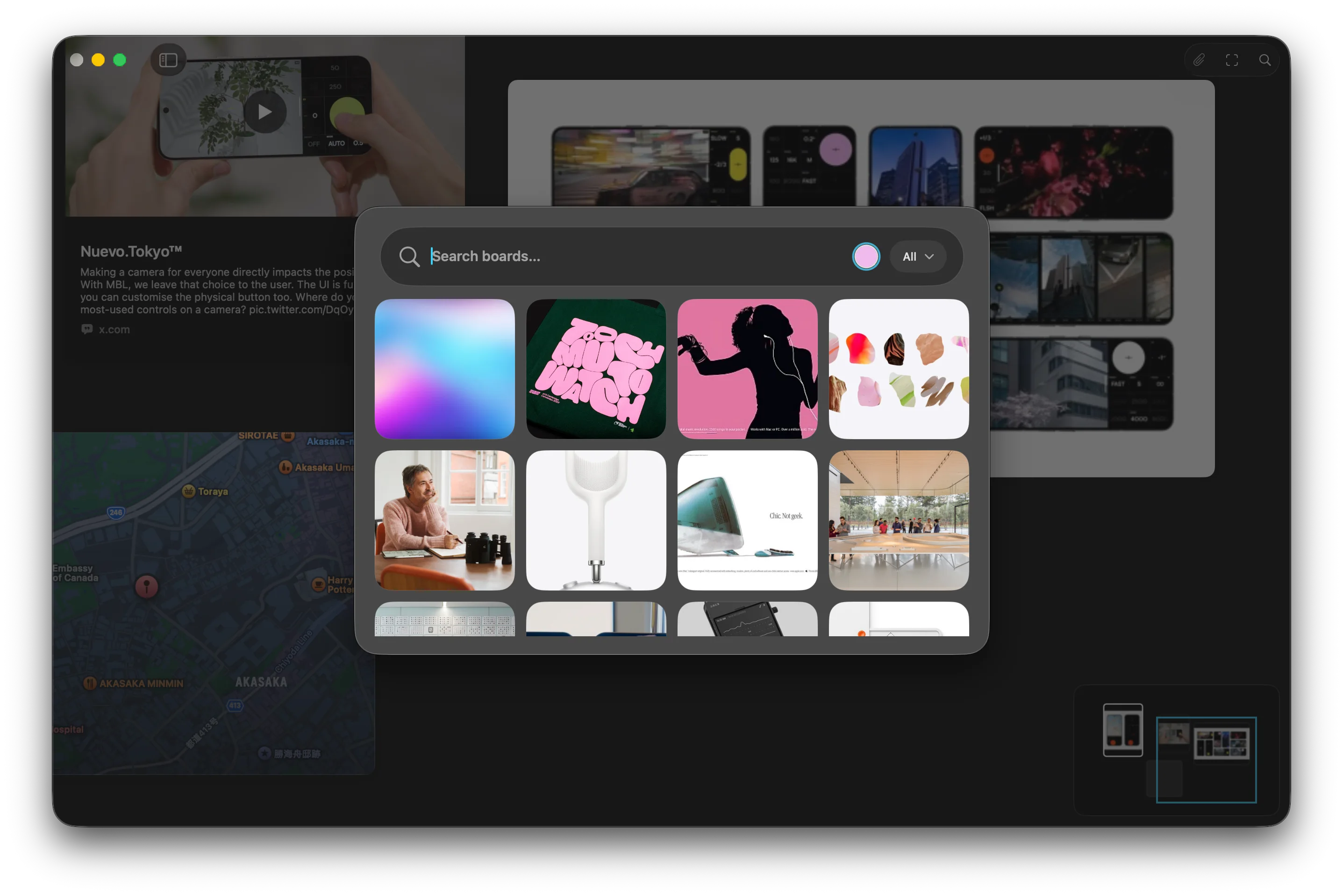
When the color is the memory
Visual search often starts before you have the right words. You might remember a washed blue, a warm concrete tone, a specific red, or the way a group of images felt together before you remember the subject, source, or filename.
That is why color search matters. A palette can be the strongest part of a reference, especially when you are trying to shape a mood, compare directions, or find the image that belongs beside another one. Reference already understood colors in saved images, but the search flow now makes that more immediate.
You can pick a color directly and use it as a search filter. Instead of choosing from a small set of named colors, you can search with the tone you actually have in mind. It is a small interaction, but it makes the board feel closer to the way visual memory works.
Search that stays visual
The point is not to turn color into another strict filing system. Most creative references do not fit cleanly into labels like blue, green, or brown. A color might be slightly dusty, almost black, soft but saturated, or somewhere between two names.
The improved color search gives Reference a little more room to find nearby matches. That makes it more useful when you are gathering references by palette, looking for related material across a larger board, or trying to return to something you saved because of its atmosphere rather than its content.
Search should not always ask you to translate the visual thing into language first. Sometimes the visual thing is already enough.
Links belong beside the images
This update also makes boards better at holding the context around a reference. You can add website links, Tweets, and Maps links to a board, and Reference turns them into cards that sit alongside the rest of your material.
That is useful because not every reference starts as an image file. A source article, a post, a place, a location, or a small piece of web context can be part of the same thought. If it has to stay in a browser tab, a note, or a separate app, it is more likely to disappear from the direction you are building.
Cards keep that context visible. A website can sit beside the image it explains. A Tweet can stay close to the idea it sparked. A Maps link can become part of a board about a place, a route, a neighborhood, or a location-based project.
A board with better memory
Together, better color search and richer link cards are both about the same thing: making a board easier to come back to.
Collecting references is quick. Understanding why they mattered later is the harder part. Color, source, location, and surrounding context are all part of that memory. The more of it Reference can keep close to the canvas, the less you have to reconstruct when you return.
The board stays visual first. It just remembers a little more of what made the reference useful.