Regions make big boards easier to revisit

Large boards are useful because they let a project spread out. Regions make that space easier to return to, letting you save areas on the canvas and jump back to specific themes, features, or short project sections without breaking the board into smaller pieces.

Reference Board showing saved regions on iPhone
Regions make large boards easier to return to.

A map for the canvas

The more useful a board becomes, the easier it is to lose your place inside it. A few saved images turn into a cluster. A cluster turns into a direction. Then, without really noticing, the board has become a small landscape of moods, features, notes, details, and half-finished thoughts.

Regions are a way to give that landscape a little more memory. You can save an area on the canvas, name it, and jump back to it later. Instead of zooming out, scanning around, and trying to remember where a particular group lives, the board can take you straight there.

It is a small navigational feature, but it changes the feeling of a large canvas. The space can stay open without becoming harder to move through.

Group themes without filing them away

Moodboards often make more sense when they stay in one place. A color direction might belong near a material study. A product detail might sit close to a typography reference because the relationship between them still matters. Splitting those things into separate boards can make them cleaner, but it can also make the project feel less connected.

Regions are meant for that middle ground. They let you group parts of a board by theme, feature, scene, or short project section while keeping everything on the same canvas. You can have one region for a visual direction, another for interface details, another for references that only make sense for a specific part of the project.

The point is not to turn the board into a folder system. It is to make the parts you already have easier to return to.

Faster returns to the right thought

Creative work involves a lot of returning. You come back to a board after a meeting, after a walk, after saving something new, or after the project has changed shape a little. The faster you can get back to the right area, the less momentum you lose on the way there.

That is where Regions are most useful. They make it easier to move from the whole project to the exact part you need: a feature idea, a styling direction, a small moodboard, or a temporary cluster for something you are still figuring out.

Reference has always been about keeping visual thinking close to the surface. Regions add another layer to that idea: a way to make big boards feel navigable without making them feel smaller.

Your Daily References

Finding good inspiration should feel simple again. The new References page brings together trusted creative sources across design, architecture, interiors, art, motion, branding, typography, photography, product design, and more, so discovery can feel calmer and more useful from the start.

Reference showing curated creative sources on the References page
References gives creative sources a calmer place to start from.

Better sources, less noise

There is more visual content than ever, but finding the right kind of inspiration can still feel scattered. Good references live across magazines, studios, blogs, galleries, product sites, architecture journals, film platforms, and design archives. They are easy to miss, easy to forget, and often hidden between everything else competing for attention.

The new References page is meant to make that quieter. It brings high-quality creative sources into one place, grouped by category and previewed with the latest image from each feed where available. You can browse what is new, move across different kinds of creative work, and follow anything interesting back to the original source.

The point is not to create another endless feed. It is to give discovery a better starting point.

Built around creative work

Reference Board started as a private place to collect inspiration: images, videos, YouTube links, quotes, sticky notes, and the small visual details that tend to matter later. The kind of things you save because they shape your taste, even before you know exactly why.

References extends that idea outward. Reference should not only help you keep inspiration close. It should also help you find better inspiration in the first place.

That matters because the beginning of a board is often the most fragile part. You are looking for direction, but you may not have the words for it yet. A calmer set of sources can help you move by taste, category, and visual instinct before the project has fully explained itself.

Curated by category

The first version includes sources across architecture and interiors, art and culture, branding and graphic design, digital design, garden and landscape, motion and film, and product design. Each source opens into its own stream of recent references, with images pulled from the latest posts where available.

It is not meant to replace the original publishers. The goal is to make discovery easier, then send people back to the source.

That is the balance References is trying to hold: useful enough to return to, quiet enough to stay out of the way, and open enough that the work still belongs where it came from.

Still early

This is the first version of References. More sources will be added. Some feeds will change. Some previews will get better. The collection will keep growing over time.

The goal is to keep it useful, visual, and focused. No endless feed. No account. No algorithm deciding what matters.

Just a calmer way to discover creative work, and a better starting point for your next board.

Moodboards Should Spark Ideas, Not Copy Them

Moodboards get a bad reputation when they are treated like shortcuts to a style. Used well, they are something more useful: a way to hold onto ideas, notice patterns, and move inspiration from one field into another without copying what it looks like.

Reference Board showing a moodboard canvas with a browser reference
A strong moodboard keeps the thought visible, not just the style.

The problem is not the board

Moodboards get a bad reputation.

It is easy to see why. A board can become a folder full of nice-looking images. A shortcut. A way to borrow the surface of something instead of finding the reason behind it. If the board is only filled with work that already looks like the thing you want to make, the project can start drifting toward imitation before anyone notices.

Everything begins to look like everything else.

But that is not really a problem with moodboards. It is a problem with how they are used.

A good moodboard is not a shopping list for style. It is a thinking tool. It gives shape to a feeling before the feeling has language. It lets you hold onto a texture, a rhythm, a mechanism, a contrast, a behavior, or a small detail that seems important even if you cannot explain it yet.

That is the part worth protecting.

The board is not saying: make it look like this.

It is saying: there is an idea here.

References can come from anywhere

One of the easiest ways to misuse a moodboard is to make the references too obvious. A brand project becomes a board of other brand projects. A website becomes a board of other websites. An app becomes a board of other apps.

Sometimes that is useful. You need to understand the category. You need to know what people expect. You need to see the clichés clearly enough to avoid them.

But the more useful references often come from somewhere else.

A product designer might save a folding chair because the hinge explains an interaction. A brand designer might save a weathered wall because the texture says something about age, trust, or memory. A digital designer might save a subway map because it handles hierarchy better than a dozen interface screenshots. A motion designer might save a piece of fabric because the fold has the timing they are looking for.

None of those references need to resemble the final work.

That is the point.

The value is not in the appearance alone. It is in the thought underneath it. What is this doing? Why does it feel this way? What structure is holding it together? What would happen if that structure moved into a different medium?

A moodboard becomes more original when it stops collecting similar-looking things and starts collecting useful thinking.

Ideas are slippery

Ideas usually do not arrive as finished concepts. They show up as observations first.

A shadow on a wall. A label on an old machine. The way a tool opens. The density of a map. The mood of a film still. The calm of a room with almost nothing in it. A color that feels older than it is. A material that makes something technical feel human.

You save the reference because something in it understands the project before you do.

That is why moodboards are useful. They give those early observations somewhere to live. They keep the thought visible long enough for another thought to attach to it.

At the beginning of a project, this should feel loose. You collect across fields. You follow strange connections. You let the board become a temporary place for the things that might matter.

Later, the board should get more selective. You remove what is only decorative. You keep what supports the concept. You start asking whether each reference is carrying an idea or just filling space.

Near the end, the board can do something different again. It can help a team understand a direction without flattening the work into one rigid style. It can make an abstract idea easier to discuss. It can give clients, collaborators, or stakeholders something to respond to before the final work exists.

In that sense, a moodboard is not only about inspiration. It is also about communication.

The danger is fixation

The real danger is not reference. The real danger is fixation.

Examples can open a door, but they can also make the room feel smaller. The more directly a reference resembles the thing you are designing, the easier it is to stay too close to it. You start borrowing the layout, the color, the type, the composition, the gesture. Not because you meant to copy, but because the example quietly became the default answer.

That does not mean the answer is to avoid references.

It means the answer is to use them with more distance.

A useful moodboard should keep asking questions:

What is the idea behind this image?

Is it about shape, material, behavior, mood, structure, contrast, movement, or memory?

What can I learn from it without copying how it looks?

Can I find the same idea in a completely different field?

That last question matters most. Original work often comes from moving an idea sideways. Something noticed in architecture becomes useful for interface design. A pattern from nature changes the way a product opens. A film scene helps explain pacing in a presentation. A manufacturing detail becomes the basis for an identity system.

The reference did not provide the answer.

It provided a way of thinking.

Collect the thought, not the style

A board full of other brand identities might help you make a brand identity that looks like other brand identities.

A board with architecture, film stills, product mechanisms, old maps, fabric, signage, tools, rituals, and natural patterns might help you find something less expected. It gives you more ways in. It makes the project harder to reduce to a trend. It reminds you that visual work is connected to the rest of the world, not just to other visual work.

That is where moodboards become powerful.

Not when they collect taste.

Not when they prove that a style is popular.

Not when they make the work easier to copy.

They become powerful when they help you remember what you were actually noticing.

A moodboard is not good or bad by itself. It is a tool. Used poorly, it can make work generic. Used well, it can help you see what you are really trying to say.

And that is the point.

Not to copy the style.

To remember the idea.

YouTube links and sticky notes belong on the board

A reference board gets better when it can hold more of the thinking around the work, not just the final still image. Reference now supports YouTube links that can be pasted or dropped straight onto the canvas, along with color-coded sticky notes that make it easier to mark intent, cluster ideas, and find them again later.

Reference Board showing a YouTube video beside a mood board canvas
Boards can now hold video references and lightweight notes in the same space.

Video, without the friction

There are plenty of moments when the thing worth saving is not a frame but the movement around it. A camera move, a pacing idea, a texture in motion, a performance detail. You can now copy and paste a YouTube link into Reference or drag it directly onto the canvas, and the app pulls in the important metadata automatically so the video is recognizable later instead of turning into a bare URL.

That matters because most people do not save a video reference at the exact moment they are ready to use it. They save it because they think it might matter later. A title, source, and thumbnail go a long way toward making that later moment easier. The app is not trying to become an offline video locker, and it does not need to. It just needs to preserve enough context that the reference stays legible.

That is the real upgrade here. Video can now live on the board in a way that feels useful instead of provisional.

Sticky notes that think like a board

There is a similar idea behind sticky notes. Notes are most helpful when they behave less like documents and more like lightweight signals: a reminder, a question, a label for a cluster, a thought you want to keep near an image before it disappears. Sticky notes now come in different colors, which gives the board a little more structure without making it feel managed.

Color becomes a quick visual cue, but it is also practical. You can filter and search sticky notes easily, which means they do not get lost once a board starts getting dense. A yellow note can stay a to-do, a pink one can hold tone, a blue one can mark research, and the system stays flexible enough that you can decide what the colors mean.

Taken together, YouTube support and sticky notes push Reference further toward being a workspace instead of just a collection. The board does not simply store assets. It keeps the surrounding thought attached to them.

Reference for Spring 2026

Reference is starting to settle into a clearer idea of what it wants to be: not just a place to store inspiration, but a place to actually think with it. This spring update sharpens that direction with a roomier canvas, faster movement between ideas, and a workflow that feels less like filing and more like creative momentum.

Reference Board showing a mood board canvas on Mac
Reference makes room for ideas to spread out naturally.

A calmer canvas

There is a temptation with creative tools to keep adding controls, panels, and metadata until the interface starts feeling more like a dashboard than a workspace. Reference is trying to move in the other direction. Boards now feel more spacious and more deliberate, which means the things you save can do what they are supposed to do: sit in front of you long enough to spark another thought.

That shift matters more than it sounds. When a board feels visually noisy, you tend to rush through it. When it feels calm, you linger. You compare two images a little longer. You notice that a texture belongs with a color study from three weeks ago. You see a connection that probably would have disappeared in a denser layout.

The goal here is not minimalism for its own sake. It is to make the app better at the quiet part of creative work, the part where you are still figuring out what the project wants to be.

Discovery that keeps moving

Reference also keeps getting better at the jump between one idea and the next. That sounds small, but it is actually where a lot of creative software falls apart. Saving an image is easy. Building momentum from it is harder. Search now does more of that connective work, helping you move by mood, color, subject, and visual similarity instead of forcing you to fully translate instinct into keywords first.

The effect is that the library starts to feel less archival and more alive. A good image can lead to another good image, which leads to a new cluster, which leads to a new board. Instead of interrupting the process, the app starts to reinforce it.

That is the larger theme of this release. Reference should not just hold inspiration after the fact. It should help you stay in motion while you are still discovering what matters.

Private Inspiration on Your Devices

Pinterest, Are.na, Savee, Cosmos, and other visual platforms all help people collect inspiration in different ways. Reference is for a quieter part of that workflow: a private, native place on iPhone, iPad, and Mac where your boards stay yours, sync through iCloud, and do not become material for tracking or resale.

Reference app shown across iPhone, iPad, and Mac
Reference keeps your inspiration close, private, and native to your Apple devices.

Different tools for different moments

There are more places than ever to find and save visual references. Pinterest is still the obvious one for broad discovery. Are.na has become a thoughtful space for connected research and public collections. Savee is fast and image-forward. Cosmos makes visual discovery feel polished and modern. There are moodboard tools, bookmark managers, social archives, and endless feeds built around taste.

They are useful because they each understand a real part of creative life. Sometimes you want breadth. Sometimes you want a public trail of ideas. Sometimes you want to browse quickly, follow a thread, or see what other people are noticing.

Reference is not built from the idea that those places are bad. It comes from a smaller observation: discovery and working with what you save do not always need to happen in the same mode.

Sometimes discovery should be open and outward-facing. Sometimes it should be curated, so you can start from better sources without wandering through everything at once. And sometimes, after you find something that catches your attention, the next step should be quieter. You want to keep it near a project, on the devices where you actually work, without turning every save into a public signal or another conversation to manage.

Reference is built around that assumption: inspiration should feel like yours first.

Pinterest, Are.na, Savee, Cosmos, and Reference

Pinterest is strongest when you want the internet to keep suggesting more. It is broad, familiar, and very good at discovery at scale. For many people, that is exactly what makes it useful. The tradeoff is that the feed is always nearby, so collecting can naturally stay connected to browsing.

Are.na is different. It is slower, more intentional, and better suited to research that benefits from connections between ideas. Channels can feel like living bibliographies. That public quality is part of its strength, especially for shared research and cultural context. Some ideas, though, need to stay unfinished without becoming part of a profile.

Savee is closer to a clean visual archive. It is good for browsing and saving images with less noise than larger social platforms. Cosmos has a similar appeal for people who want a more aesthetic, contemporary discovery layer. Both make inspiration feel easier to gather, and that is valuable. They still sit closer to discovery than to the private, project-level work that happens after something is saved.

Reference is not trying to replace those places as sources. It is trying to give the things you find a calmer native place to land.

That distinction matters. Discovery and collecting are related, but they are not the same thing. A discovery platform helps you find more. A private reference board on your own devices helps you understand what you have found, why it matters, and where it might belong.

Private by default changes the work

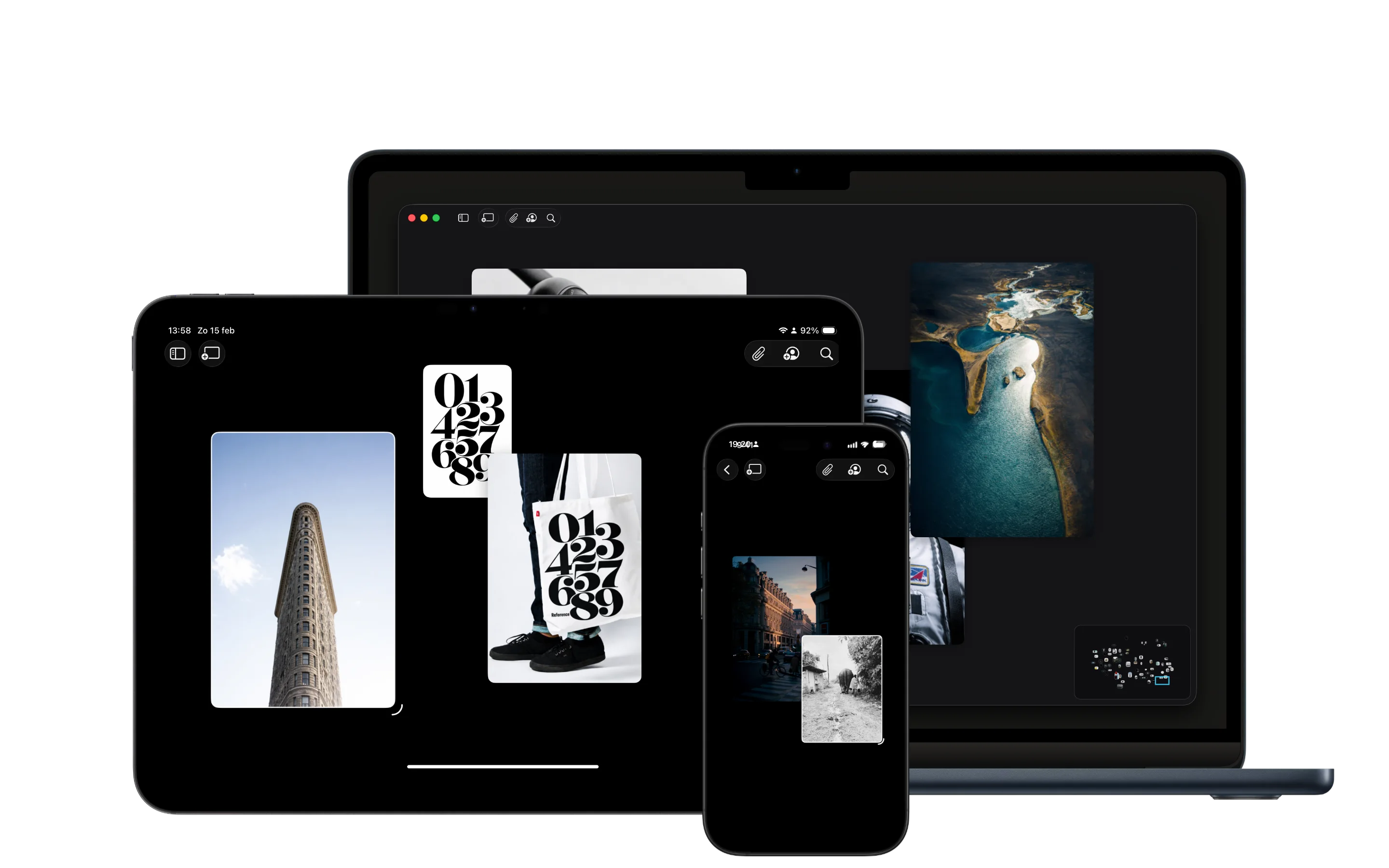
The homepage says it simply: Reference is a private moodboard app for iPhone, iPad, and Mac. Save inspiration, organize moodboards, find similar images, and keep creative references in sync across your own devices.

Native matters here too. Reference is not another tab you have to keep open or another public profile you have to maintain. It is a place for boards to live alongside the rest of your work, close to the screenshots, notes, images, videos, links, and fragments you are already collecting across iPhone, iPad, and Mac.

The privacy page puts it plainly: Reference does not track you, lock you in, or sell your data. Your inspiration stays private, and syncing happens through iCloud across your own Apple devices.

Private is not just a feature checkbox. It changes the emotional shape of the tool.

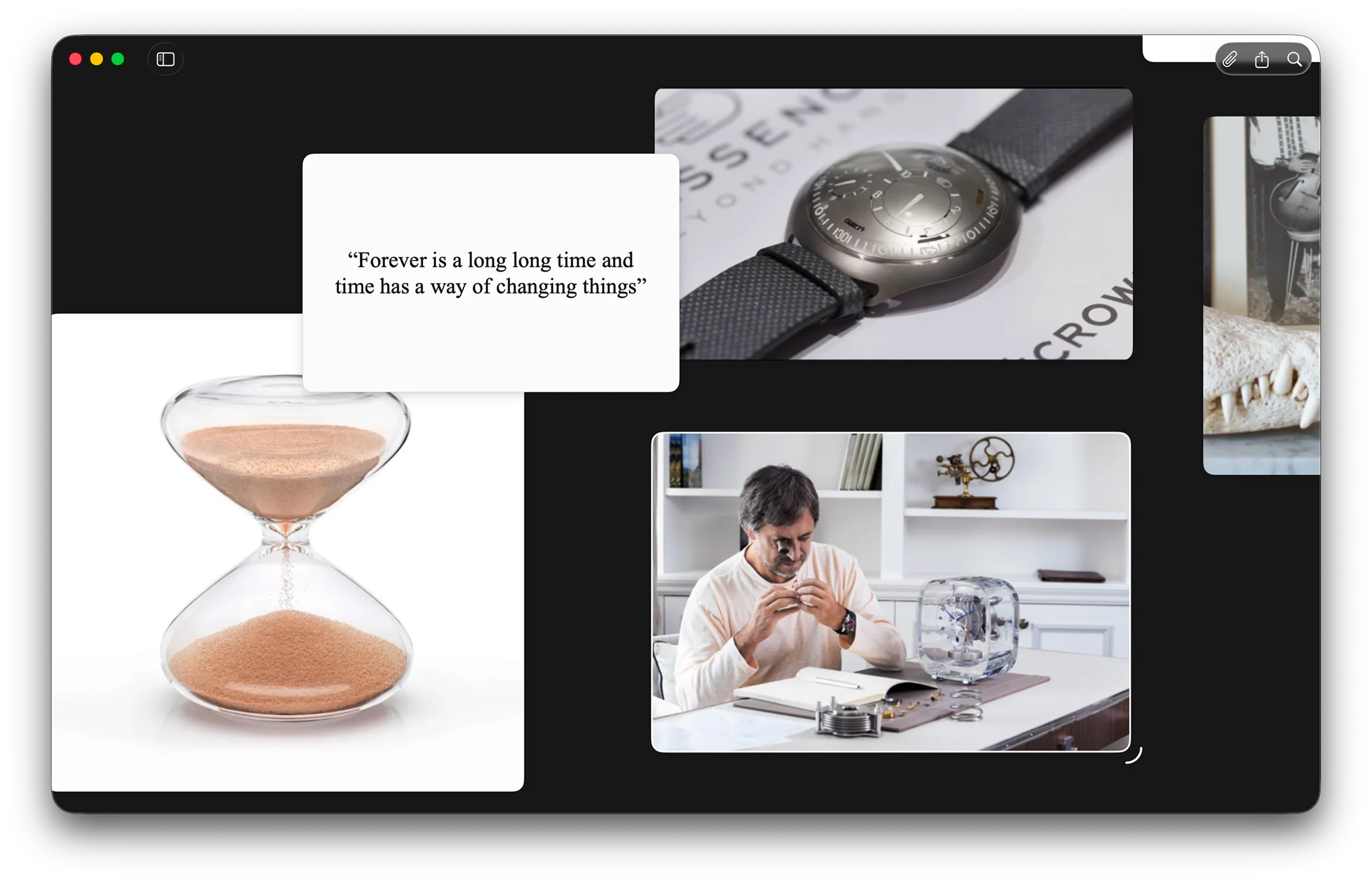
When a board is private, it can be messy. It can hold weak signals, half-formed directions, contradictory images, notes you might delete later, and references that only make sense to you. You do not have to perform taste. You do not have to name a collection before it deserves a name. You can save something simply because it feels relevant.

That is important because a lot of creative work begins before language catches up. You may not know why a room, color, product shot, poster, camera move, or bit of type feels useful yet. You only know that it does. A good board should let that early instinct stay intact long enough to become a direction.

Curated discovery, native collecting

Feeds are good at motion. They can be generous, surprising, and useful. They are not always the right environment for the slower part of thinking.

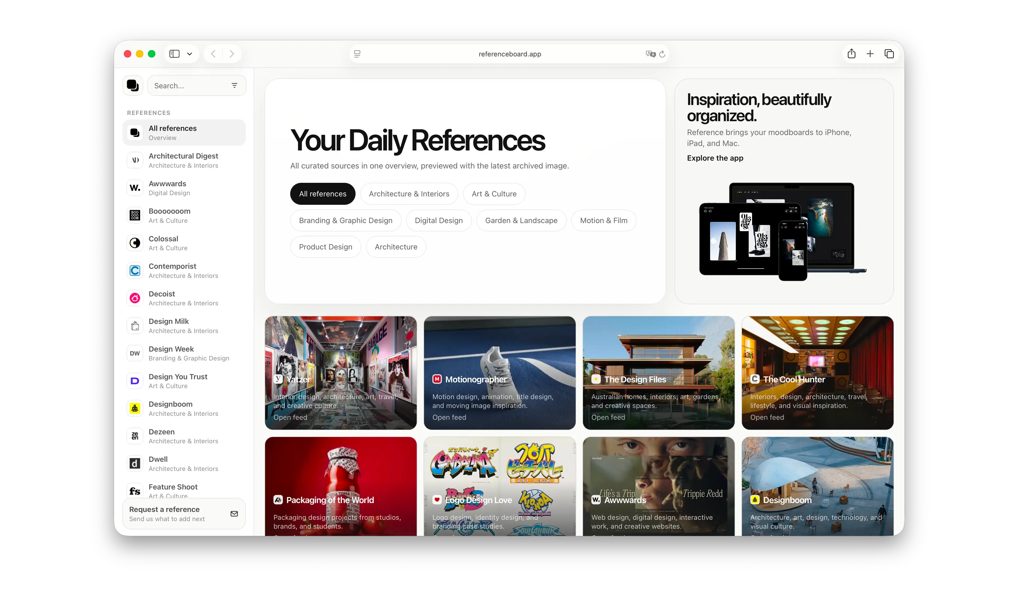
The new References page exists because finding better creative sources still matters. Good inspiration lives across studios, magazines, galleries, architecture journals, product sites, blogs, film platforms, and design archives. The goal is to build a curated list of places worth returning to, then make it easy to follow the work back to where it came from.

That requires some care. The list should respect the original publishers, artists, studios, and platforms that make the work available in the first place. Reference should be a doorway, not a replacement. It should help discovery feel calmer without pretending the work belongs anywhere other than its source.

So References can use feeds as a practical way to surface what is new, but that is different from making the whole product feel like a social feed. The point is to make discovery easier, then let you bring what matters into your own native space.

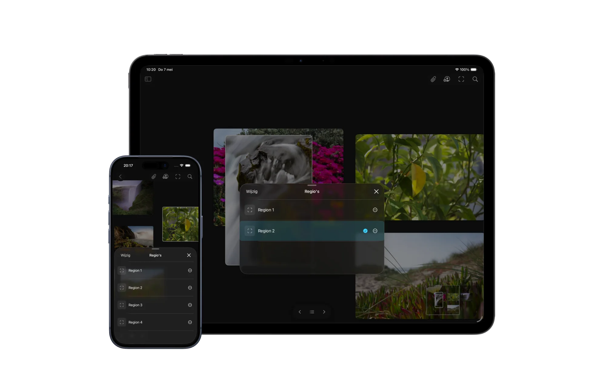
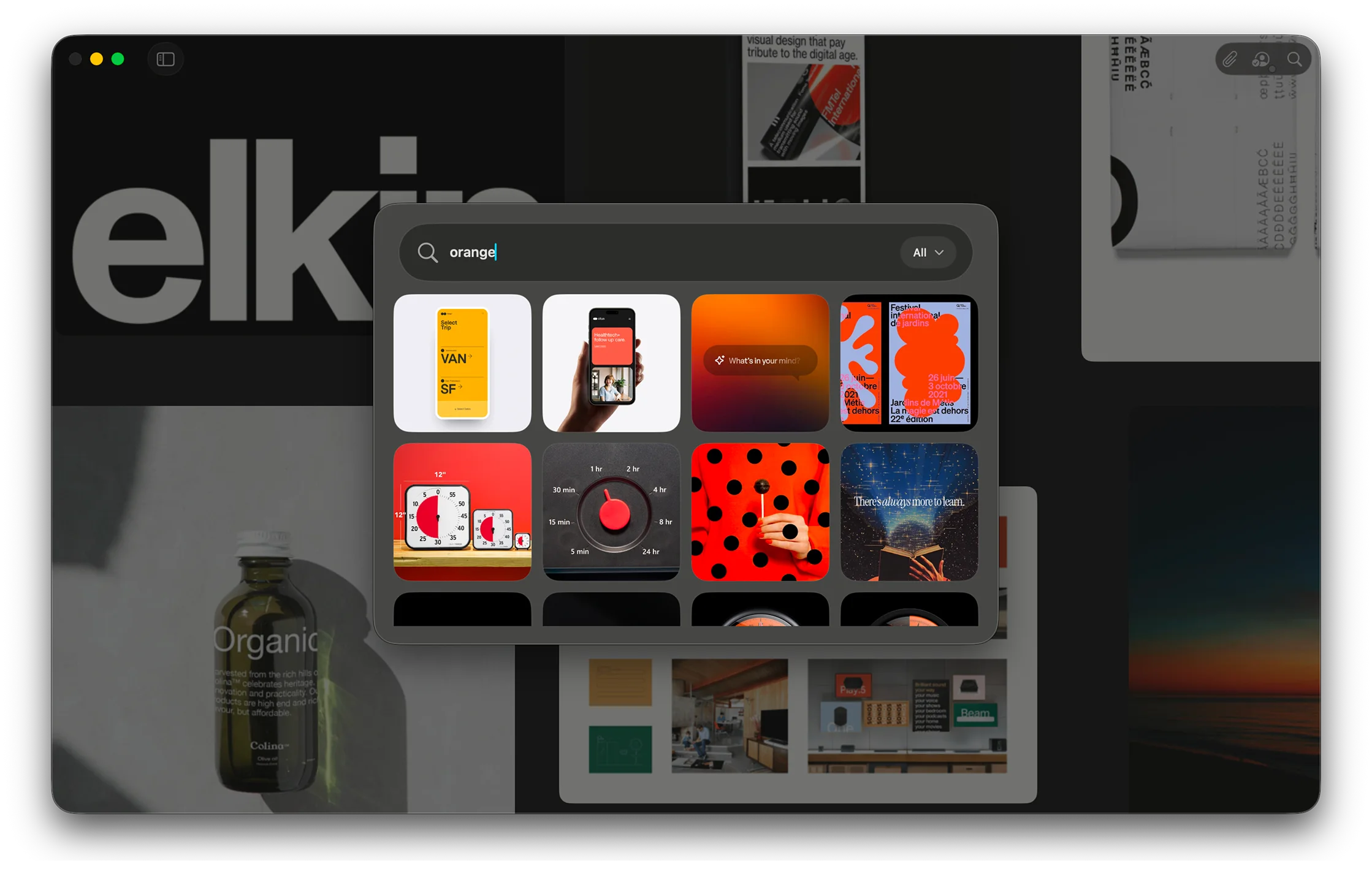
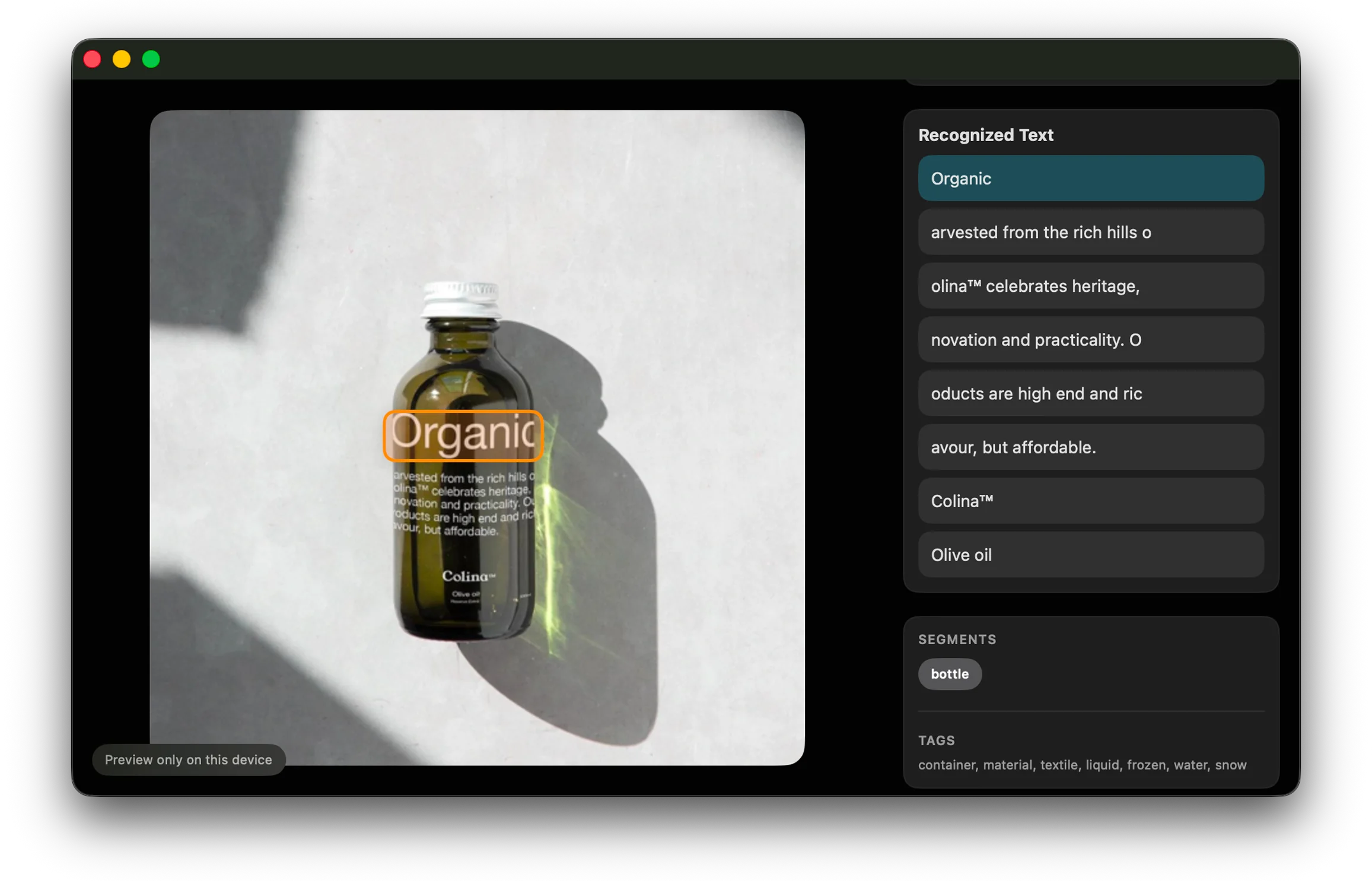
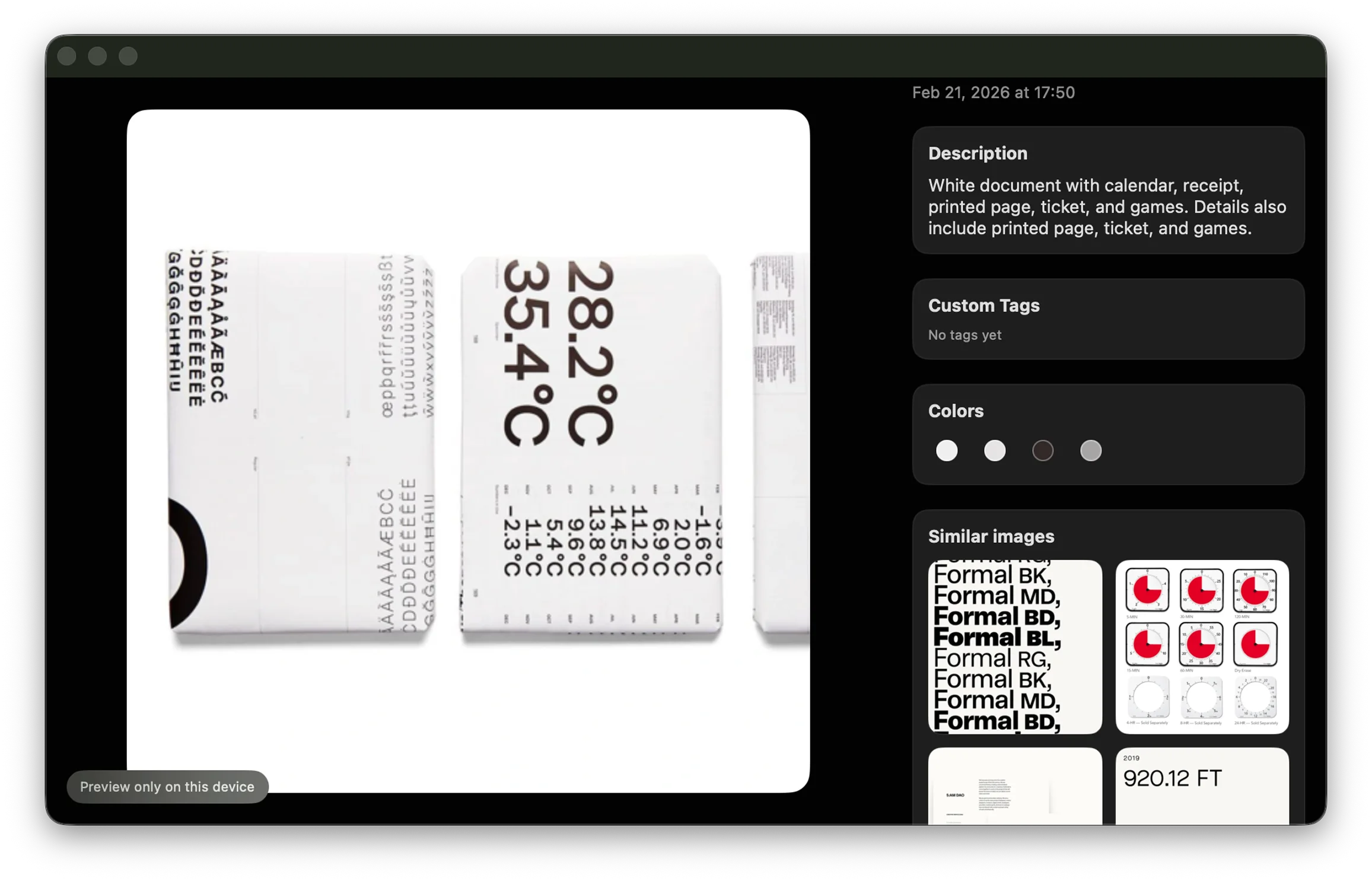
Once something is on a board, the rhythm should change. You should be able to sit with it. Compare it. Put it next to a note, a quote, a YouTube link, a video, or another image. Search it later by color, style, visible text, or the words you remember. Let it become part of a project instead of another item passing through a stream.

The canvas is where research turns into ideas

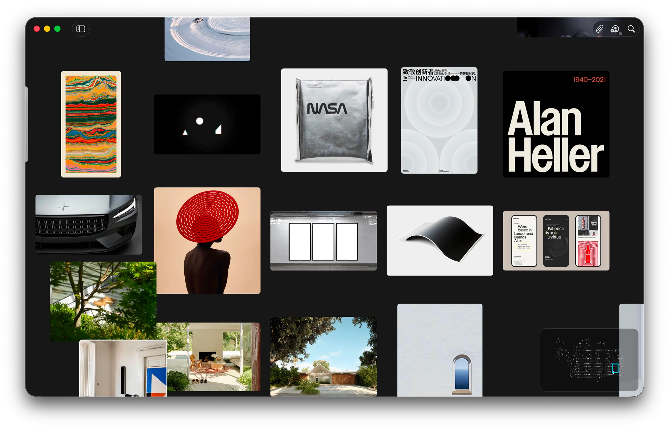
Saving inspiration is only the first step. The real work often starts when you begin arranging it: one image next to another, a material beside a color, a quote near a product shot, a video next to a still frame. A canvas gives those relationships room to appear.

That is why Reference is built around boards, not just folders. Curation is a way of thinking. When you place references in space, you start to notice patterns that were not obvious when everything was in a list. A cluster might reveal a palette. A repeated shape might point toward a direction. Two unrelated images might suddenly explain the feeling you were trying to find.

The infinite canvas matters because early ideas rarely arrive in a neat order. They spread out, overlap, contradict each other, and slowly become clearer. Reference gives that research a private surface where it can stay unfinished long enough to become useful.

Your taste should stay private

Creative references are personal. They reveal what you are looking at before you are ready to explain what you are making. They can point toward clients, pitches, campaigns, interiors, products, films, identities, and ideas that are still private for good reason.

That is why the difference between a private workspace and a public inspiration platform matters. It is not only about convenience. It is about choosing the right place for the right kind of attention.

There is an old internet tradeoff that is worth being honest about: when something is free, your attention often becomes part of the product. That does not make every free tool bad. It just means the incentives can be different. A service may need more engagement, more signals, more recommendations, or more reasons for you to keep coming back.

Reference Board is meant to stay on the quieter side of that line. It is just the app. A place to put your inspiration, not a network trying to own the relationship around it.

No public follower graph. No pressure to turn your research into content. No need for every board to talk back to a network. No algorithm deciding what matters. No tracking your private taste so it can be sold, modeled, or pushed back at you. Just a native place for the material that belongs to the project and to you.

Just a place to collect what sparks something, keep the context attached, and return to it when the project is ready.

A home for the things worth keeping

Pinterest, Are.na, Savee, Cosmos, and the rest can still be part of a creative workflow. Sometimes they are where discovery starts. Sometimes they are where a trail opens up. The difference is what happens next.

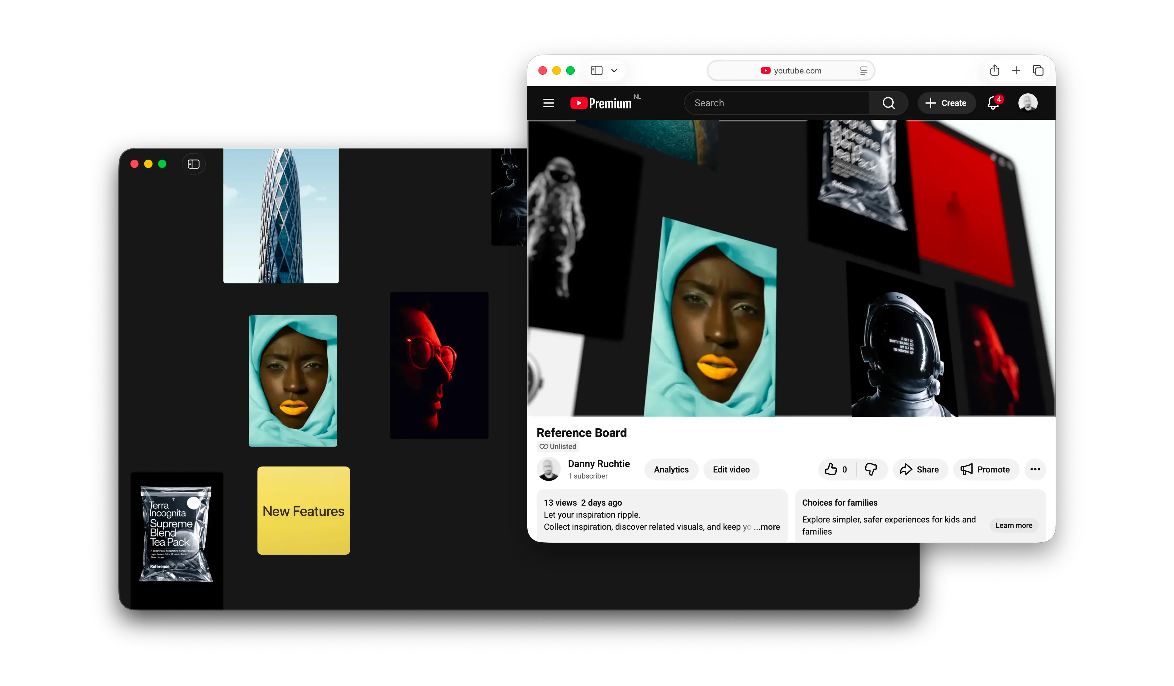
Reference is for the next part: the private board where a reference becomes useful because it sits beside other references, notes, clips, colors, and fragments of thought. The place where inspiration stops being content and starts becoming material you can work with on your own devices.

That is the goal. Not a better version of every other tool. Not a judgment on how anyone else collects. Just a quieter home for the part of inspiration that feels personal, unfinished, and worth keeping close. You should own your inspiration because it is yours, not something someone else gets to shape, package, or sell back to you.

Your inspiration, kept close.

Visual search that keeps momentum going

The best search tools do not make you feel like you are searching. They make you feel like you are continuing a thought. Visual search in Reference is built around that idea, helping one strong reference turn into a chain of better ones without forcing you to stop and over-explain what you are looking for.

Reference Board showing visual search results
Search becomes part of the creative process, not a separate task.

Find the next reference faster

This feature is for the common moment when you know the direction is right, but the specific image is not quite there yet. Maybe the composition works, but the palette does not. Maybe the shape language is right, but the styling is too polished or too literal. Visual search lets you start from that almost-right image and keep moving.

That matters because creative search is rarely linear. You are often not looking for an answer so much as triangulating toward one. The more an app understands that, the less it asks you to interrupt your process just to operate the tool.

Reference can now use the image itself as the prompt in a more useful way, surfacing nearby options that feel connected in tone, subject, and atmosphere. The result is a search experience that feels more exploratory and less transactional.

A better bridge from collecting to building

There is also a practical payoff here. Once search starts returning the right kind of material more consistently, building a board becomes faster. You stop bouncing between separate apps or tabs. You stop exporting mental notes about why you saved something in the first place. The board can develop in one place.

That is really what this feature is about. Not search as a database trick, but search as a bridge between collecting references and actually shaping a visual direction.

OCR makes the smallest details searchable

A lot of what makes an image useful is not the whole image. It is the little thing inside it you happened to notice: a brand mark, a line of copy, a type treatment, a label on a bottle. OCR in Reference is built for those moments, quietly turning overlooked details into something you can actually find again later.

Reference Board recognizing text inside an image
Small text inside saved images becomes searchable later.

Text, quietly indexed

Reference now reads visible text inside your saved images automatically, which means the app can remember details you probably were not thinking about when you hit save. That may be a headline, a product label, a bit of signage, or a tiny piece of typography that felt important in the moment and then vanished into the board later.

This is one of those features that sounds technical until you use it in a real workflow. Then it just feels obvious. Of course the title on the poster should be searchable. Of course the word on the packaging should help you get back to the image. Of course the app should remember the details you only half remember yourself.

By indexing text in the background, Reference becomes better at preserving the reasons an image was useful, not just the image itself.

Useful memory, not just more metadata

The key is that this does not ask you to do extra work. You are not expected to tag every asset by hand or maintain a perfect filing system. The app picks up context while you keep collecting.

That makes OCR feel less like a productivity feature and more like a memory feature. It helps the library stay legible even after it has grown large enough that you would normally start forgetting what is in it.

Boards feel more organized without more effort

Organization is usually where creative tools start asking for too much discipline. Reference is trying to do the opposite. With automatic descriptions, tags, and color cues, the library can stay orderly in the background while the foreground stays focused on collecting, arranging, and seeing what fits.

Reference Board showing automatically generated tags and organization
Reference keeps your library tidy while you keep collecting.

Organization in the background

There is an old problem with reference libraries: they usually begin as a source of energy and eventually turn into a source of maintenance. The larger they get, the more time you spend naming, sorting, and cleaning them up. Reference is leaning harder into the idea that a good tool should absorb some of that burden for you.

Automatic descriptions and tags help create structure without turning every save action into a form to fill out. Color cues add another layer of orientation, especially when you are scanning a large collection quickly and mostly thinking with your eyes.

That means the library stays useful longer. It can grow without immediately becoming harder to navigate.

Less admin, more continuity

The bigger benefit is continuity. When it is easy to save something and trust that you will be able to find it later, you collect more freely. You stop hesitating. You stop deciding that something is not worth saving because organizing it will become tomorrow’s problem.

That kind of friction is subtle, but it shapes how people use a tool. Remove enough of it and the product starts to feel lighter, even as it becomes more capable.

Mixed media belongs on the same board

Creative direction rarely arrives in a single format. Sometimes it is an image. Sometimes it is a line of text, a sticky note, a video clip, or a reference link you do not want to lose. Reference is becoming more useful precisely because it treats those materials as parts of the same thought instead of separate categories that need separate tools.

Reference Board mixing images, quotes, and video
Images, notes, quotes, and video can all live together.

A good board is rarely just a stack of pretty images. It usually has context around it: a phrase that explains the mood, a note about why something works, a video clip that captures movement, a link that holds onto a source you are not ready to use yet but do not want to forget.

Reference now makes more room for that reality. Quotes, notes, video, and YouTube can sit alongside still images in the same space, which makes the board feel more like an active work surface and less like a gallery wall.

That distinction matters. A gallery is where you admire finished choices. A workspace is where you make them.

Context is part of the reference

When different media types can live together, the board gets better at holding intent. The image is still important, but so is the note beside it. So is the clip that explains the pacing. So is the quote that captures the tone you are after.

In other words, the context stops being something you have to keep in your head. It can live on the board where it belongs, next to the reference that sparked it.